TapSite
Mobile Application

RESPONSIBILITIES
User Interviews, Research Synthesis, Journey Map, Sketches, Wireframes, Prototype
TEAM
3 Members
TIMELINE
6 Weeks
TOOLS
Figma, Google Suite, Zoom, Slack
CLIENT GOALS
TapSite is a Phoenix based startup focused on enhancing customer experiences within local businesses.
-
Generate traffic: bring attention to underrepresented small businesses in the Phoenix Area
-
Increase number of reviews and feedback: customer reviews will help owners improve their businesses
-
Create loyalty: providing coupons will encourage customers to visit new local establishments and increase loyalty with TapSite
TapSite is looking for help in quickly connecting users to small businesses and driving traffic to local establishments through incentivized feedback.
THE CHALLENGES
-
Our team had constraints with limited to no contact with target small businesses
-
Client was very resistant of research
-
TapSite did not provide a budget, so we were unclear of obtainable product features
-
Because TapSite is a start-up, we need to focus on acquiring trust of users
THE SOLUTIONS
-
Presenting quantitative and qualitative research findings to gain clients trust in our design process
-
Frequent communication with TapSite via WhatsApp to confirm moving decisions forward
-
Conducting multiple rounds of user tests with several iterations to acquire both user and client feedback
SURVEY
77%
Shop at local businesses at least once a month
The first step of our research consisted of distributing a recruitment survey to identify our target users shopping behaviors and motivations. Based on 26 respondents, here's what we uncovered:
75%
Leave feedback based on a good experience
50%
Leave feedback based on a bad experience
44%
Use coupons at least once a month
INTERVIEWS
As a team, we then conducted a total of 10 interviews to help us get a deeper look at our users. Through an affinity mapping exercise, here is what I uncovered:
-
Users are interested in supporting more local businesses in their community
-
Incentives encourage users to leave feedback and/or reviews, but they value their time tremendously
-
Users need transparency about programs that they are signing up for
My family and I like to try different places and I prefer local restaurants and stores... they have a story to tell
I am okay to give my information but I should know what I am signing up for...
I mean, I would do it if like you leave a review, you get a discount or something, then I wouldn't mind
COMPETITIVE
ANALYSIS
We took time to dive into what our competitors were providing, and how we could integrate features into our app.
The features that can be considered for TapSite based on the analysis of the businesses below:
-
Coupon Categories
-
Digital In-App Coupons
-
Coupon Filters
-
Membership
-
Rewards earned by writing reviews


PERSONA
Based on my research synthesis, we created a persona that represents a community supporter looking for a quick and easy way to save money, share positive experiences with others and get connected to other small businesses of interest.

Jacob Martin
A/C Technician
"I want to save money when trying new local spots, and help connect others to my favorite businesses in my area"
BIO
Jacob is a long time Phoenix resident and spends his weekends running errands due to his demanding job as an AC technician throughout the week. Supporting local businesses is very important to him and he would love for others to be connected to his favorite places. While he loves trying new establishments, he typically looks for deals wherever he goes but finds it hard to do so.
GOALS
-
Find more small businesses to support
-
Save money on quality goods and services
-
Encourage others in his community to shop local
PAINS
-
Shopping local tends to be more expensive
-
Has never received discounts at local establishments
-
Feels that leaving reviews takes too long
THE PROBLEM (S)
-
How might we quickly and efficiently connect Jacob to local businesses so that he feels good about supporting his community?
-
How might we allow Jacob to find deals and discounts when hiring local services he is not too familiar with?
-
How might we ensure the quality of local establishments before Jacob chooses a coupon?
-
How might we incentivize Jacob to leave feedback for local businesses?
PRODUCT FEATURE PRIORITIZATION
Using the MoSCoW method, we narrowed down the primary features we would focus on during this design sprint
Must Have
Should Have
Could Have
Won't Have
-
Landing Page with current business user is in
-
Sign-Up/Log-In
-
Coupon Categories/Selection
-
Questionnaire
-
Connection to other businesses
-
In-App coupon redemption
-
Option to provide direct feedback to business owners
-
Visibility of specific coupons
-
Loyalty program
-
Google Review feature
-
Sharing/Gifting coupons
-
Coupon filters
-
"Subscribing" to businesses
-
TapSite frequent user tracker
-
Yelp Review feature
-
Review Gating (business facing)
-
Online shopping feature
JACOB'S JOURNEY
Creating a Journey Map was pivotal in helping us empathize with our user and their interaction with TapSite

USER FLOW 1
Jacob's pathway to earning a coupon with TapSite!


USER FLOW 2
Iterating a simplified user flow based on client and peer feedback!
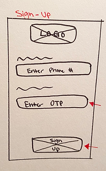
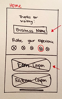
SKETCHES
Sign-Up
Home Screen
Survey
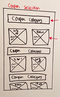
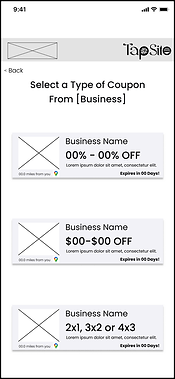
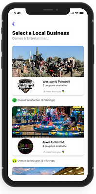
Coupon Selection

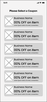
WIREFRAMES
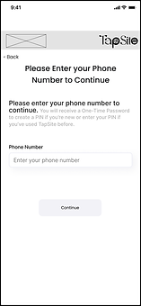
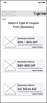
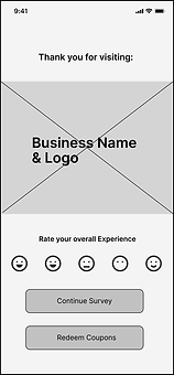
Before diving into visual design, we made sure to build out low fidelity wireframes in order to test if our designs would be successful. Would users even find it intuitive? Is our design comprehensive?
Design #1


Design #2


USABILITY TESTING
Design #1
Design #2
We conducted 2 rounds of usability testing with our low fidelity designs. Our first round of testing was for the design that our client initially favored, while the second design focused more on our teams research and understanding of user desires.
73%
Success Rate
100%
Success Rate
1 - 5 min
Time Taken
3.7/5
Satisfaction Score
25 sec - 2 min
Time Taken
4/5
Satisfaction Score
SOLUTION HYPOTHESIS
Our team followed up with this solution hypothesis to represent our initial ideas of the perfect solution to the issue we are seeking to solve.
"Jim will find the most affordable, efficient, and quality services available through TapSite connecting him to local businesses and allowing him to leave incentivized feedback."
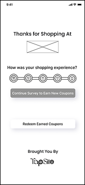
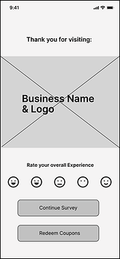
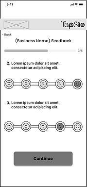
DESIGN ITERATIONS
I improved our design based on several usability tests with both low fidelity and high fidelity prototypes. Multiple changes were made based off positive and negative feedback regarding ease of use and UI elements.
Low Fidelity 1
Low Fidelity 2

High Fidelity 1

Final Product
Low Fidelity 1

Low Fidelity 2

High Fidelity 1
Final Product
Low Fidelity 1

Low Fidelity 2

High Fidelity 1
Final Product
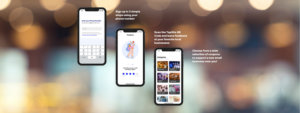
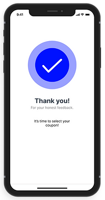
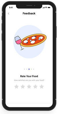
FINAL PROTOTYPE
NEXT STEPS

How will businesses owners use TapSite?
More research would need to be done with small business owners to understand what exactly they would be looking to get from users leaving feedback with TapSite. We would also need to create and test the business owner facing interface.
How can we get users to actually use TapSite?
Based on user interviews and usability testing feedback, users are interested in using TapSite... How can we encourage users to actually use it?
Conducting a field test?... 👀